> ## Documentation Index
> Fetch the complete documentation index at: https://docs.appcharge.com/llms.txt
> Use this file to discover all available pages before exploring further.
# Customize Your Web Store Layout Using Blocks
This article explains how to customize your web store layout in the Template Editor using Blocks. Blocks represent sections of the store page, such as the header, bundles, banners, or footer. Use Blocks to control how each section appears in the store and where it appears in the page layout.
In this article, you'll learn how to:
* **Configure a Block:** Adjust settings such as theme, layout style, and the number of offers that appear per row.
* **Reorder a Block:** Change where a section appears in the page layout.
* **Hide or show a Block:** Control whether a section appears in the store.
* **Group Blocks:** Group blocks to appear in a single row in the store.
* **Ungroup Blocks:** Separate grouped blocks.
Blocks control the layout of the store, not the content. Your active offers and Publisher Dashboard configurations determine the offers and other data that appear in each section.
For example, if you hide the **Bundles** Block, Bundle offers won't appear in the store even if they are active. If you show the **Bundles** Block but haven't created any Bundle offers, the store doesn't show the section.
## Configure a Block
Each Block includes configuration settings that control how its section appears in the web store. These settings vary by Block and may include layout style, the number of offers that appear per row, or the visual theme. A theme controls the organization of each section.
Use the Center Panel to preview your Blocks and page layout. The preview uses placeholder designs from the Assets Library.
To configure a Block:
1. In the Left Sidebar, click the Block you want to configure.
2. Adjust the available settings for that Block:
The header is the top section of the web store.
To configure the header, complete the following fields:
* **Show Logo:** Toggle on to display your logo in the top-right corner of the web store.
* **Show Player Name:** Toggle on to display the player's name in the top-left corner.
* **Show Player ID:** Toggle on to display the player's ID in the top-left corner.
* **Sticky Header:** Toggle on to keep the header at the top when the player scrolls.
* **Background Opacity (%):** Set the opacity of the header background image.
* **Text Color:** Select a color for header text.
The popup displays an offer in an overlay modal when specific actions occur in the web store.
You can preview the Daily Bonus in the following states:
* Badge
* Popup
The Daily Bonus preview shows how the Block appears in your web store store.
You can preview the Daily Bonus in the following states:
* Badge
* Popup
The popup preview supports the following aspect ratios:
* **1:1 Ratio:** Square.
* **2:3 Ratio:** Vertical rectangle.
Select an aspect ratio to preview the popup. The same popup ratio appears in both mobile and desktop previews.
The Reward Calendar preview shows how the Block appears in your web store store.
You can preview the Reward Calendar in the following states:
* Badge
* Popup
* **Themes:** Use the drop-down menu to select a visual theme for your Bundles.
* **Offer Per Row (Mobile):** Choose how many offers appear per row on mobile devices. Note that some themes have a set amount of offers per row.
Display the player's current game level.
Select the Progress Bar design you want to use.
* **Themes:** Use the drop-down menu to select a visual theme for your Special Offers.
Use the text box to add custom rich text content to the store.
Select the Banner design you want to use.
* **Desktop Layout:** Use the drop-down menu to select the direction of the Rolling Offer on desktop.
* **Themes:** Use the drop-down menu to select a visual theme for your Rolling Offers.
* **Show Appcharge Logo:** Toggle on to display the Appcharge logo in the store footer.
3. To save your changes, click **Update**.
## Reorder a Block
You can reorder Blocks to change where the sections appear in the page layout.
You can't reorder **Header** and **Popup** Blocks.
To reorder a Block:
1. Hover over the Block you want to move. A drag handle appears on the left side of the Block.
2. Click and hold the drag handle, and then drag the Block to the desired position.
## Hide or show a Block
Hide or show a Block to control whether its section appears in the store. When you hide a Block, you remove the section from the web store without deleting its configuration.
You can't hide **Header** and **Popup** Blocks.
To hide or show a Block:
1. Hover over the Block you want to hide or show. The eye icon appears on the right side of the Block.
2. Click the eye icon to toggle the Block’s visibility:
* When you hide a Block, the eye icon appears closed and the Block text turns gray.
* When you show a Block, the eye icon appears open and the Block text turns black.
You can toggle the eye icon at any time to re-enable a hidden Block.
## Group Blocks
You can combine multiple eligible Blocks into one visual group so their badges appear side by side in the web store. To group Blocks, make sure each Block has a badge that can align with the others. You can group the following Blocks:
* Daily Bonus
* Triggered Popups
* Reward Calendar
To group your Blocks:
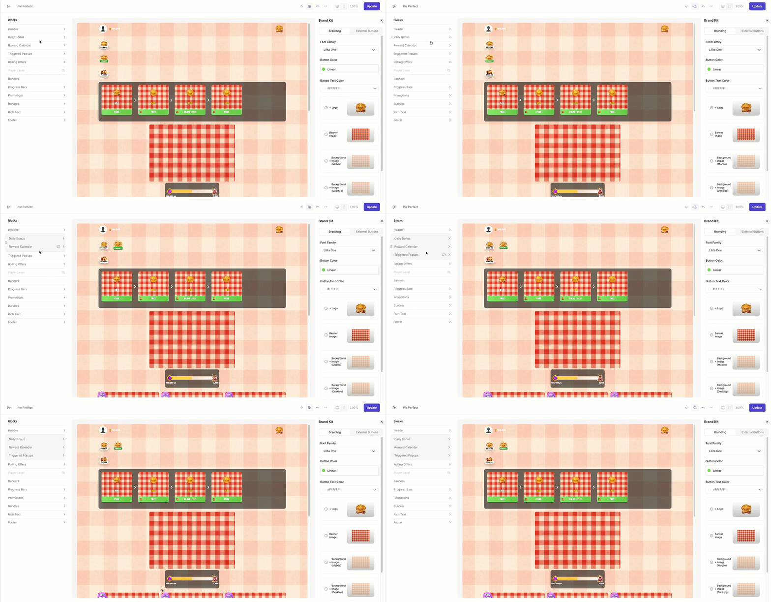
1. In the Blocks list, move two eligible Blocks next to each other, then hover between them. The **Group** indicator appears only when eligible Blocks touch.
2. Click the **Group** indicator.
3. To add more Blocks to the group, repeat the process with eligible Blocks.
The preview automatically displays grouped Block badges side by side. If the badges exceed the row width, they wrap to the next line. Published templates use the same layout in the live web store.
 After you group Blocks, you can't reorder them in the group. To reorder grouped Blocks, ungroup them, reorder them, and then group them again.
### Move Grouped Blocks
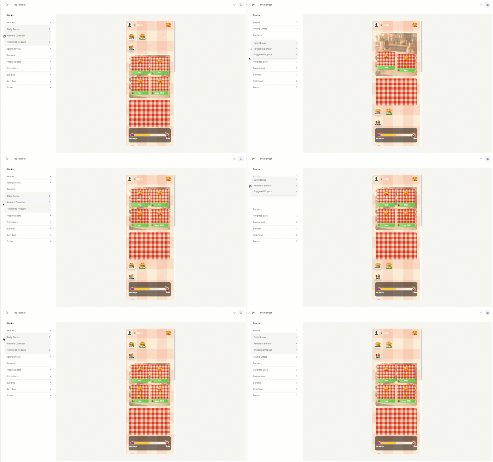
Grouped Blocks move together as a single unit using the **drag handle:**
## Ungroup Blocks
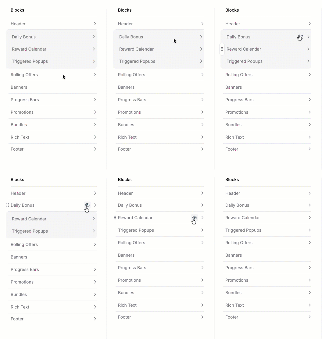
To ungroup your Blocks, click the **Unlock** icon on any Block to remove it from the group. If only one Block remains, the gray container disappears.
After you group Blocks, you can't reorder them in the group. To reorder grouped Blocks, ungroup them, reorder them, and then group them again.
### Move Grouped Blocks
Grouped Blocks move together as a single unit using the **drag handle:**
## Ungroup Blocks
To ungroup your Blocks, click the **Unlock** icon on any Block to remove it from the group. If only one Block remains, the gray container disappears.